Statistics: Data Analysis and Representation
Decoding the Data Vibe 📈
Introduction
1. Introduction
Alright, let's talk about stats. Before you scroll away, this isn't just about boring charts. Statistics is the secret language behind everything you do online – from your Spotify Wrapped playlist to your gaming stats and even how Instagram decides what to show you on your feed. It's the ultimate life hack for making sense of a chaotic world.
In this chapter, we're going to become data detectives. First, we'll figure out how to find a 'typical' value in a sea of numbers with Averages and Spread (is your average screen time really that high?). Then, we'll learn how to present that data without putting everyone to sleep using powerful Data Representation techniques. We'll even see if there's a connection between two things, like hours spent studying and your exam grade, using Scatter Diagrams. Finally, we'll level up with Cumulative Frequency graphs to see where you rank in a group and master Histograms, the pro version of bar charts. Let's get it!
In this chapter, we're going to become data detectives. First, we'll figure out how to find a 'typical' value in a sea of numbers with Averages and Spread (is your average screen time really that high?). Then, we'll learn how to present that data without putting everyone to sleep using powerful Data Representation techniques. We'll even see if there's a connection between two things, like hours spent studying and your exam grade, using Scatter Diagrams. Finally, we'll level up with Cumulative Frequency graphs to see where you rank in a group and master Histograms, the pro version of bar charts. Let's get it!
2. Measures of Central Tendency and Spread
Alright, let's break down 'Averages and Spread'. Think of it as getting the main character energy and the overall vibe of a set of data. First up, the measures of central tendency – these are your 'averages', which tell you the typical value.
The Mean is the one you know best: add everything up and divide by how many there are (). It's like finding the average score for your squad in a game. But be careful! The mean is super sensitive to outliers (extreme values). If one friend gets a god-tier score, it can pull the whole team's average up, making it seem like everyone did better than they actually did.
Next, the Median. This is the literal middle value when you line up all your data in order. If you have an even number of data points, you just find the mean of the two middle ones. The median doesn't care about outliers; it's the chill, unbothered center. It’s a better representation when your data has some wild high or low values.
Finally, the Mode is the easiest of all: it's just the value that shows up the most. Like the one song that's on repeat on everyone's Spotify playlist. A dataset can have one mode, more than one, or no mode at all.
Now for the measures of spread – this is all about how consistent or spread out your data is. The Range is the simplest: just subtract the smallest value from the biggest. It tells you the total spread, but like the mean, it's easily skewed by one random high or low value.
A much better measure is the Interquartile Range (IQR). This sounds complex, but it's just the range of the middle 50% of your data. First, find the median (which is also the second quartile, ). Then, find the median of the lower half of the data – that's your lower quartile, . The median of the upper half is your upper quartile, . The IQR is simply .
The Mean is the one you know best: add everything up and divide by how many there are (). It's like finding the average score for your squad in a game. But be careful! The mean is super sensitive to outliers (extreme values). If one friend gets a god-tier score, it can pull the whole team's average up, making it seem like everyone did better than they actually did.
Next, the Median. This is the literal middle value when you line up all your data in order. If you have an even number of data points, you just find the mean of the two middle ones. The median doesn't care about outliers; it's the chill, unbothered center. It’s a better representation when your data has some wild high or low values.
Finally, the Mode is the easiest of all: it's just the value that shows up the most. Like the one song that's on repeat on everyone's Spotify playlist. A dataset can have one mode, more than one, or no mode at all.
Now for the measures of spread – this is all about how consistent or spread out your data is. The Range is the simplest: just subtract the smallest value from the biggest. It tells you the total spread, but like the mean, it's easily skewed by one random high or low value.
A much better measure is the Interquartile Range (IQR). This sounds complex, but it's just the range of the middle 50% of your data. First, find the median (which is also the second quartile, ). Then, find the median of the lower half of the data – that's your lower quartile, . The median of the upper half is your upper quartile, . The IQR is simply .
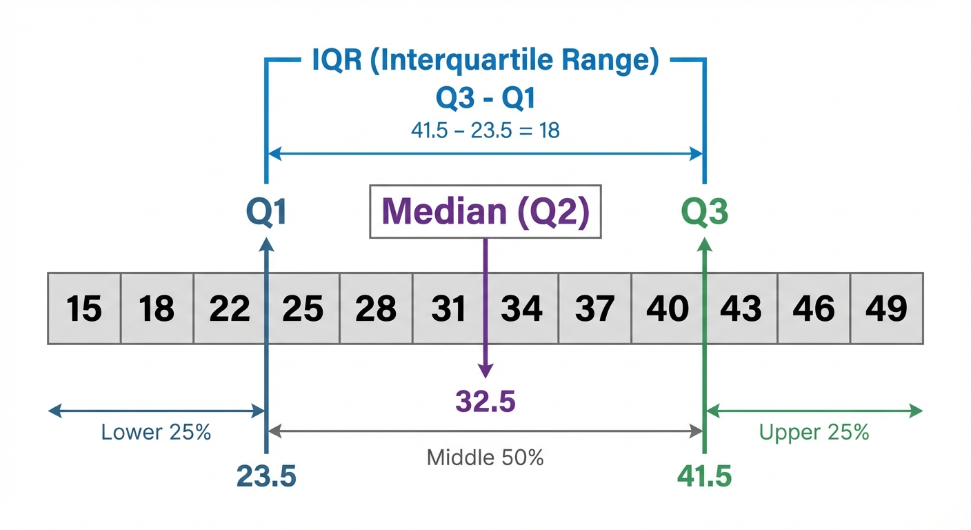
The IQR ignores the extreme highs and lows, giving you a solid idea of where the 'main bulk' of your data lies. A small IQR means your data is consistent (like getting similar lap times in a race), while a large IQR means it's all over the place.
When data is grouped into a frequency table, we can't find the exact mean, but we can estimate it. You find the midpoint of each group, multiply it by the frequency, sum those up, and divide by the total frequency. The Modal Class is even easier – it's just the group with the highest frequency. Easy win!
When data is grouped into a frequency table, we can't find the exact mean, but we can estimate it. You find the midpoint of each group, multiply it by the frequency, sum those up, and divide by the total frequency. The Modal Class is even easier – it's just the group with the highest frequency. Easy win!
Worked example
Estimating Mean and Identifying Modal Class from Grouped Data
Tackling Grouped Data Like a Boss 💪
The table shows the time (in minutes) 50 students spent on their part-time job shifts one weekend. Estimate the mean time and identify the modal class.
| Time, (hours) | Frequency, |
|---|---|
| | 4 |
| | 15 |
| | 22 |
| | 9 |
| Time, (hours) | Frequency, |
|---|---|
| | 4 |
| | 15 |
| | 22 |
| | 9 |
- 1First, let's find the modal class. This is the easiest mark you'll get! Just look for the class interval with the highest frequency.The highest frequency is 22, which corresponds to the class .
Modal Class = hours - 2To estimate the mean, we need a single value to represent each class. We use the midpoint () of each interval. Let's add columns for the midpoint () and for frequency times midpoint ().Midpoints:
For , midpoint is
For , midpoint is
For , midpoint is
For , midpoint is - 3Now, calculate the column by multiplying the frequency of each class by its midpoint. This weights each midpoint by how many students are in that group.values:
- 4Time to find the totals. We need the sum of the frequencies, , (which should be 50, as stated in the problem) and the sum of the column, .
- 5Finally, we can estimate the mean using the formula. Divide the total of the column by the total frequency.
So, the estimated mean time spent on a shift is 4.44 hours.
Answer
So, the estimated mean time spent on a shift is 4.44 hours.
So, the estimated mean time spent on a shift is 4.44 hours.
3. Data Representation: Charts and Diagrams
Alright, let's talk about data. It's literally everywhere – from your Spotify Wrapped stats to your K/D ratio in a game. Raw data is just a massive list of numbers, which is kinda boring and hard to understand. That's where data representation comes in. It's all about giving that data a visual 'glow up' so we can see patterns and trends instantly. Think of it as turning a messy spreadsheet into a fire Instagram infographic.
First up, the basics: a simple frequency distribution is just a fancy name for a table that organizes your data. It lists the items or groups and their frequency (how many times they appear). From there, we can build some awesome charts.
• Bar Charts: You know these. They use bars to show frequencies of different categories, like the most popular phone brand in your year group. But we can level them up! A dual bar chart places bars side-by-side to compare two sets of data, like comparing your screen time on TikTok vs. Snapchat each day.
First up, the basics: a simple frequency distribution is just a fancy name for a table that organizes your data. It lists the items or groups and their frequency (how many times they appear). From there, we can build some awesome charts.
• Bar Charts: You know these. They use bars to show frequencies of different categories, like the most popular phone brand in your year group. But we can level them up! A dual bar chart places bars side-by-side to compare two sets of data, like comparing your screen time on TikTok vs. Snapchat each day.
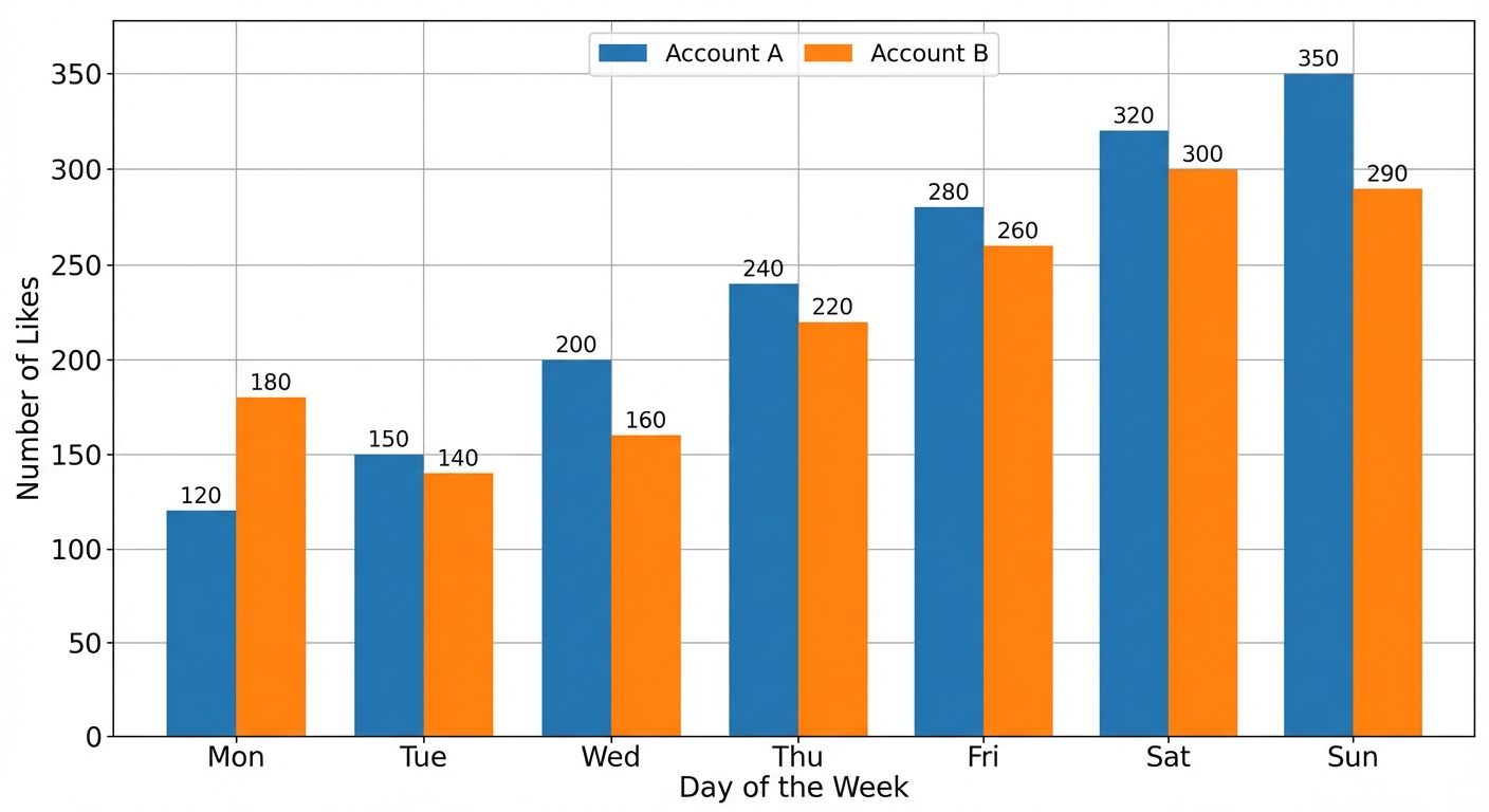
A composite (or stacked) bar chart stacks the data on top of each other in a single bar. This is perfect for showing how a total is broken down. Imagine a bar showing your total part-time job earnings for a month, stacked to show how much came from weekday vs. weekend shifts.
• Pie Charts: These are all about showing proportions of a whole, like slicing up a pizza. Each slice represents a category, and the size of the slice shows what percentage of the total it is. To find the angle for each slice, you use the formula: Angle = . Super useful for things like showing the breakdown of your monthly spending.
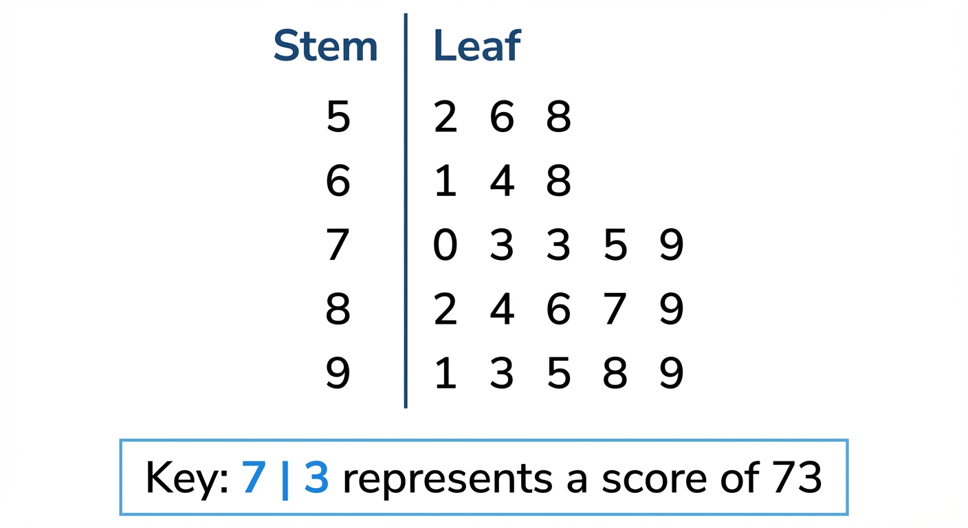
• Stem-and-Leaf Diagrams: These are a super clever way to show the shape of your data and keep all the original numbers. It's like a bar chart on its side. The 'stem' is the first part of the number (e.g., the tens digit) and the 'leaf' is the last digit. Two rules you absolutely CANNOT forget: 1) The leaves must be ordered (smallest to largest). 2) You MUST include a key to explain what it means (e.g., Key: 7 | 2 means 72). Forgetting the key is a classic exam mistake, so don't let that be you!
• Pie Charts: These are all about showing proportions of a whole, like slicing up a pizza. Each slice represents a category, and the size of the slice shows what percentage of the total it is. To find the angle for each slice, you use the formula: Angle = . Super useful for things like showing the breakdown of your monthly spending.
• Stem-and-Leaf Diagrams: These are a super clever way to show the shape of your data and keep all the original numbers. It's like a bar chart on its side. The 'stem' is the first part of the number (e.g., the tens digit) and the 'leaf' is the last digit. Two rules you absolutely CANNOT forget: 1) The leaves must be ordered (smallest to largest). 2) You MUST include a key to explain what it means (e.g., Key: 7 | 2 means 72). Forgetting the key is a classic exam mistake, so don't let that be you!
Worked example
Worked Example: Stem-and-Leaf Diagrams and Composite Bar Charts
Let's Sort This Data Out 📊
A survey records the number of hours 12 students spent driving in one month after getting their license. The results were:
15, 8, 21, 34, 16, 25, 9, 15, 22, 30, 11, 21
a) Construct an ordered stem-and-leaf diagram for this data.
b) The students were from two different driving schools: 'AutoDrive' and 'GoFast'. The data is split as follows:
• AutoDrive: 15, 21, 9, 15, 30, 11
• GoFast: 8, 34, 16, 25, 22, 21
Group the data into classes 0-9, 10-19, 20-29, 30-39 and draw a composite bar chart to compare the two schools.
15, 8, 21, 34, 16, 25, 9, 15, 22, 30, 11, 21
a) Construct an ordered stem-and-leaf diagram for this data.
b) The students were from two different driving schools: 'AutoDrive' and 'GoFast'. The data is split as follows:
• AutoDrive: 15, 21, 9, 15, 30, 11
• GoFast: 8, 34, 16, 25, 22, 21
Group the data into classes 0-9, 10-19, 20-29, 30-39 and draw a composite bar chart to compare the two schools.
- 1First, let's create the ordered stem-and-leaf diagram for all 12 students. The 'stem' will be the tens digit (0, 1, 2, 3) and the 'leaf' will be the units digit. It's best to do a rough, unordered version first, then write out the neat, ordered final version.Unordered:
0 | 8 9
1 | 5 6 5 1
2 | 1 5 2 1
3 | 4 0
Now, let's put the leaves in order for our final answer: - 2Crucial step! Don't forget the key. Without it, the diagram is meaningless. This tells us how to read the numbers.Key: 1 | 5 means 15 hours
- 3For part (b), we need to organize the data for the two driving schools into a frequency table using the given classes. We just count how many students from each school fall into each time bracket.Frequency Table:
| Hours | AutoDrive | GoFast |
|---------|-----------|--------|
| 0-9 | 1 | 1 |
| 10-19 | 3 | 1 |
| 20-29 | 1 | 2 |
| 30-39 | 1 | 1 | - 4Now we plan the composite bar chart. The horizontal axis (x-axis) will be our 'Hours' classes. The vertical axis (y-axis) will be the 'Frequency' (number of students). Each bar will represent an hour bracket, and we'll stack the frequencies for 'AutoDrive' and 'GoFast' on top of each other. We also need a legend to show which color represents which school.Plan:
- X-axis: Classes (0-9, 10-19, 20-29, 30-39)
- Y-axis: Frequency (from 0 up to at least 4, as the max height for a stack is 3+1=4 for the 10-19 bar)
- Legend: One color/pattern for AutoDrive, another for GoFast. - 5Let's describe the final chart. For the '10-19' class, you'd draw the 'AutoDrive' bar up to a frequency of 3, and then stack the 'GoFast' bar (with a height of 1) on top of it, making the total bar height 4. You do this for all four classes. Remember to give your chart a title, like 'Driving Hours for Different Schools'.[IMAGE_PLACEHOLDER_3: A completed composite bar chart with 'Hours' on the x-axis and 'Frequency' on the y-axis. Each of the four bars is stacked to show the number of students from AutoDrive and GoFast, with a clear legend distinguishing the two schools.]
Answer
[IMAGE_PLACEHOLDER_3: A completed composite bar chart with 'Hours' on the x-axis and 'Frequency' on the y-axis. Each of the four bars is stacked to show the number of students from AutoDrive and GoFast, with a clear legend distinguishing the two schools.]
4. Bivariate Data and Scatter Diagrams
Alright, let's talk about Bivariate Data. It sounds complex, but 'bi' just means two. So, we're looking at the relationship between two different variables at once. Think: does the number of hours you spend revising affect your exam score? To see this, we use a scatter diagram. It's a graph where you plot points (as little 'x's) for your two variables. Each 'x' represents one piece of data, like one student's revision time and their score.
Once plotted, you look for the vibe between them, which we call correlation. There are three types:
• Positive Correlation: As one variable increases, the other tends to increase too. Like, the more hours you work, the more money you earn. The points trend upwards.
Once plotted, you look for the vibe between them, which we call correlation. There are three types:
• Positive Correlation: As one variable increases, the other tends to increase too. Like, the more hours you work, the more money you earn. The points trend upwards.
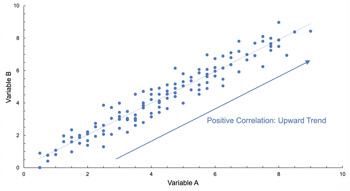
• Negative Correlation: The opposite. As one goes up, the other goes down. For example, the more data you use streaming shows, the less battery life you have. The points trend downwards.
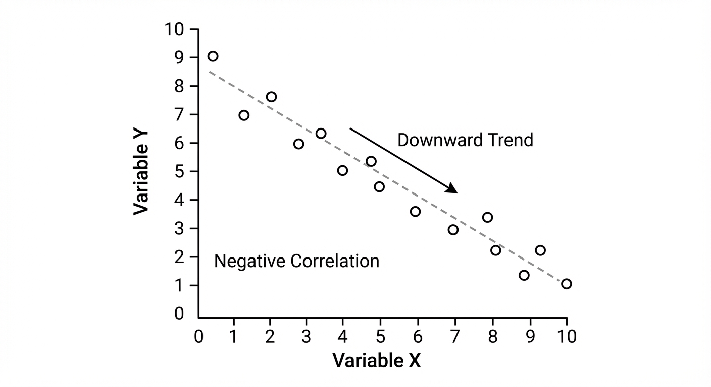
• Zero Correlation: No connection at all. The points are scattered randomly. Think shoe size vs. your gaming score – they're unrelated.
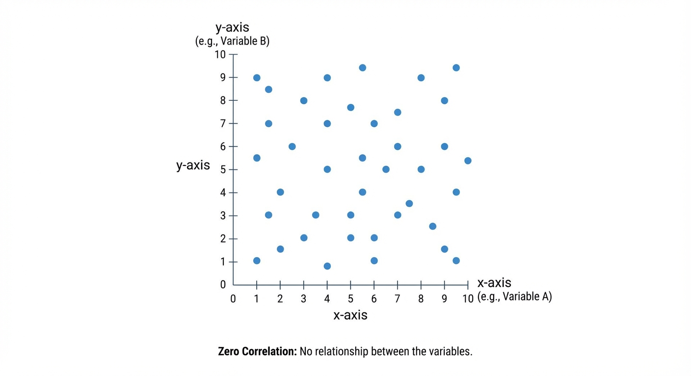
If there is a correlation, we can draw a line of best fit. This is a single, straight line you draw with a ruler that goes through the middle of your data cloud. It's drawn by eye, aiming to have roughly the same number of points above and below the line along its whole length. This line is awesome for making predictions, like estimating a score for a certain amount of revision time.
Worked example
Worked Example: Revision Time vs. Test Scores
Does more cramming actually lead to a better grade? Let's find out! 📚✍️
The table below shows the number of hours 10 students spent revising for a maths test and the score they achieved.
Hours (h): 1, 2, 2.5, 4, 4.5, 5, 6, 7, 7.5, 9
Score (%): 45, 50, 62, 65, 71, 74, 80, 88, 85, 95
(a) Draw a scatter diagram for this data.
(b) Describe the correlation.
(c) Draw a line of best fit.
(d) Use your line to estimate the score for a student who revised for 3.5 hours.
Hours (h): 1, 2, 2.5, 4, 4.5, 5, 6, 7, 7.5, 9
Score (%): 45, 50, 62, 65, 71, 74, 80, 88, 85, 95
(a) Draw a scatter diagram for this data.
(b) Describe the correlation.
(c) Draw a line of best fit.
(d) Use your line to estimate the score for a student who revised for 3.5 hours.
- 1First, set up your axes. Put 'Hours Revising (h)' on the horizontal x-axis and 'Test Score (%)' on the vertical y-axis. Make sure your scales are sensible and cover all the data values. Then, carefully plot each pair of values as a small 'x'. For example, the first point is at (1, 45).[IMAGE_PLACEHOLDER_4: A scatter diagram with correctly labelled axes and all 10 points plotted as 'x's.]
- 2Look at the pattern of the points. They generally go up from left to right. This means as the number of hours revising increases, the test score also tends to increase. So, we have a strong positive correlation.The data shows a strong, positive correlation.
- 3Now, take a clear ruler and draw a single straight line that goes through the middle of the points. You want to 'balance' the points, so there are roughly an equal number of 'x's on either side of the line along its entire length. It doesn't have to pass through any of the points exactly.[IMAGE_PLACEHOLDER_5: The same scatter diagram as before, but now with a straight line of best fit ruled through the points.]
- 4To estimate the score for 3.5 hours of revision, find 3.5 on the horizontal (hours) axis. From there, draw a vertical line up until you hit your line of best fit. Then, draw a horizontal line across to the vertical (score) axis and read the value. Your answer may vary slightly depending on your line, but it should be reasonable.Find on the x-axis. Follow the line up to the line of best fit, then across to the y-axis. The estimated score is approximately 64%. (Note: Your answer might be between 62% and 66% and still be correct).
Answer
Find on the x-axis. Follow the line up to the line of best fit, then across to the y-axis. The estimated score is approximately 64%. (Note: Your answer might be between 62% and 66% and still be correct).
5. Cumulative Frequency Tables and Diagrams
Alright, let's talk about Cumulative Frequency. The name sounds way more complicated than it is, I promise! Think of it like your XP in a video game or your follower count on Insta – it’s a running total that only ever goes up. 'Cumulative' just means 'how much so far?'.
First, we build a cumulative frequency table. You start with a normal grouped frequency table (like 'time spent gaming') and add a new column. For the first group, the cumulative frequency is just its frequency. For the next group, you add its frequency to the previous cumulative total. You keep doing this, adding as you go, until the last entry in your cumulative frequency column equals the total number of data points. Easy.
Next, we draw the graph, which has a cool name: an ogive. This is the S-shaped curve you've probably seen. Here’s the key move: you plot the cumulative frequency (y-axis) against the UPPER bound of each class interval (x-axis). This is a classic spot to lose marks, so don't forget it! Plot your points with a little 'x' and then join them with a smooth curve. Your curve should start from the lower bound of the first group at a frequency of 0.
First, we build a cumulative frequency table. You start with a normal grouped frequency table (like 'time spent gaming') and add a new column. For the first group, the cumulative frequency is just its frequency. For the next group, you add its frequency to the previous cumulative total. You keep doing this, adding as you go, until the last entry in your cumulative frequency column equals the total number of data points. Easy.
Next, we draw the graph, which has a cool name: an ogive. This is the S-shaped curve you've probably seen. Here’s the key move: you plot the cumulative frequency (y-axis) against the UPPER bound of each class interval (x-axis). This is a classic spot to lose marks, so don't forget it! Plot your points with a little 'x' and then join them with a smooth curve. Your curve should start from the lower bound of the first group at a frequency of 0.
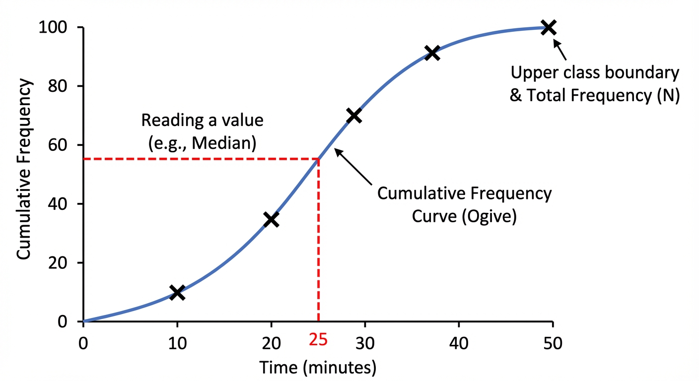
So why bother? Because this graph is a powerhouse for estimating values. To find the median (the middle value, or Q2), you find the halfway point on your y-axis (), read across to your curve, and then drop down to the x-axis. Boom, estimated median. You can do the same for the lower quartile (Q1) at the 25% mark () and the upper quartile (Q3) at the 75% mark (). The interquartile range (IQR) is just , showing the spread of the middle 50% of your data. You can even find any percentile – wanna know the top 10%? Find the value at the 90% mark! This is super useful for seeing where you rank in test scores or how your part-time job hours compare to everyone else's.
Worked example
Worked Example: Analysing Streaming Times
Let's Decode This Data 🎧
The table shows the time, (in hours), that 120 students spent streaming music in a week. Use this data to estimate the median, the interquartile range, and the number of students who streamed for more than 13 hours.
- 1First, we need to create a cumulative frequency table. We'll add a new column and create a running total of the frequencies. Remember to use the upper bounds for plotting later!Here is the completed table:
Time ( hours) | Frequency | Cumulative Frequency
----------------|-----------|---------------------
| 12 | 12
| 30 | 42 (12 + 30)
| 48 | 90 (42 + 48)
| 22 | 112 (90 + 22)
| 8 | 120 (112 + 8) - 2To find the median (Q2), we find the position of the middle value. The total frequency is 120, so the median is at the ()th position. On your graph, you would go to 60 on the cumulative frequency axis, read across to the curve, and then down to the time axis.
Reading from the graph, this gives an estimated median time of approximately 9.8 hours. - 3Now for the quartiles. The lower quartile (Q1) is at the 25% mark and the upper quartile (Q3) is at the 75% mark. We find their positions and read the corresponding times from our graph.
From the graph, Q1 is approx. 7.0 hours.
From the graph, Q3 is exactly 12 hours. - 4The interquartile range (IQR) is the difference between the upper and lower quartiles. It tells us the spread of the middle 50% of the students' streaming times.
- 5Finally, to find the number of students who streamed for more than 13 hours, we first find how many streamed for 13 hours or less. Go to 13 on the time axis, read up to the curve, and then across to the cumulative frequency axis. Then, we subtract this from the total number of students.From the graph, the number of students streaming up to 13 hours is approx. 96.
So, an estimated 24 students are the super-streamers!
Answer
From the graph, the number of students streaming up to 13 hours is approx. 96.
So, an estimated 24 students are the super-streamers!
So, an estimated 24 students are the super-streamers!
6. Histograms and Frequency Density
Alright, let's talk histograms. You've probably seen bar charts since you were a kid, right? They're great for separate, distinct categories, like your favourite artists on Spotify. But what about continuous data, like the exact time it takes you to get to school? That's where histograms come in. They look like bar charts, but the bars are all squished together because the data flows from one category to the next.
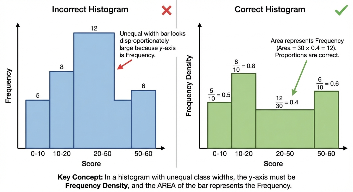
Now, here's the plot twist. Sometimes, the groups (or 'class intervals') aren't the same width. Maybe one group is for people who game 0-2 hours a week, but the next is for 2-6 hours. If we just make the bar's height the frequency, the 2-6 hours bar would be twice as wide and look way more important, which is totally misleading. It's like comparing a 2-hour movie with a 30-minute episode of a show; you can't just compare them directly. To make it a fair comparison, we use a secret weapon called Frequency Density. This is the absolute key. Instead of the y-axis being 'Frequency', on a proper histogram, it's always 'Frequency Density'.
The formula is your new best friend: This genius move standardizes everything. It means that the area of each bar (, or ) is what actually represents the frequency. This is the golden rule! So, when you look at a histogram, don't just look at how high the bars are; look at their total area to understand the real story of the data.
Now, here's the plot twist. Sometimes, the groups (or 'class intervals') aren't the same width. Maybe one group is for people who game 0-2 hours a week, but the next is for 2-6 hours. If we just make the bar's height the frequency, the 2-6 hours bar would be twice as wide and look way more important, which is totally misleading. It's like comparing a 2-hour movie with a 30-minute episode of a show; you can't just compare them directly. To make it a fair comparison, we use a secret weapon called Frequency Density. This is the absolute key. Instead of the y-axis being 'Frequency', on a proper histogram, it's always 'Frequency Density'.
The formula is your new best friend: This genius move standardizes everything. It means that the area of each bar (, or ) is what actually represents the frequency. This is the golden rule! So, when you look at a histogram, don't just look at how high the bars are; look at their total area to understand the real story of the data.
Worked example
Worked Example: Calculating Frequency Density and Interpreting a Histogram
Let's Build This Thing 🏗️
The table shows the time, (in hours), that 80 students spent on a part-time job in one week. We need to calculate the frequency densities and draw a histogram for this data.
| Time, (hours) | Frequency |
|---|---|
| | 15 |
| | 25 |
| | 24 |
| | 16 |
| Time, (hours) | Frequency |
|---|---|
| | 15 |
| | 25 |
| | 24 |
| | 16 |
- 1First up, we need to figure out the 'Class Width' for each group. This is just the difference between the upper and lower bounds of the time interval.For , Class Width =
For , Class Width =
For , Class Width =
For , Class Width = - 2Now we can calculate the Frequency Density for each group using our key formula: . Let's get these values so we know how high to draw our bars.For : F.D. =
For : F.D. =
For : F.D. =
For : F.D. = - 3Time to draw! Set up your axes. The x-axis will be 'Time, (hours)' and it needs to go up to 30. The y-axis is the crucial one: label it 'Frequency Density'. Based on our calculations, it needs to go up to at least 5.[This step describes the drawing process, which would result in a visual histogram. No calculation here, just the setup for drawing.]
- 4Now, draw the bars. The first bar goes from 0 to 10 on the x-axis and has a height of 1.5. The second bar goes from 10 to 15 and has a height of 5.0. Keep going for all the groups. Remember, no gaps between bars!Bar 1: Width (0 to 10), Height 1.5
Bar 2: Width (10 to 15), Height 5.0
Bar 3: Width (15 to 20), Height 4.8
Bar 4: Width (20 to 30), Height 1.6 - 5Let's check our work by re-calculating a frequency from the histogram. What's the frequency for the group? We find the area of that bar. This confirms that area = frequency.It matches the table! We nailed it. ✨
Answer
It matches the table! We nailed it. ✨
7. Classifying and Tabulating Statistical Data
Before you can calculate a single average, you need to organise the data. Raw numbers are like an unsorted Spotify playlist — useless until you clean it up. Two key distinctions to drill in:
• Qualitative vs quantitative. Qualitative = non-numerical (colours, favourite artist, sport). Quantitative = numerical.
• Discrete vs continuous. Discrete = specific separate values: number of siblings, shoe size, goals scored. Continuous = any value in a range: height, weight, time. (If you can 'count' it, it's discrete. If you 'measure' it, usually continuous.) ⚖️
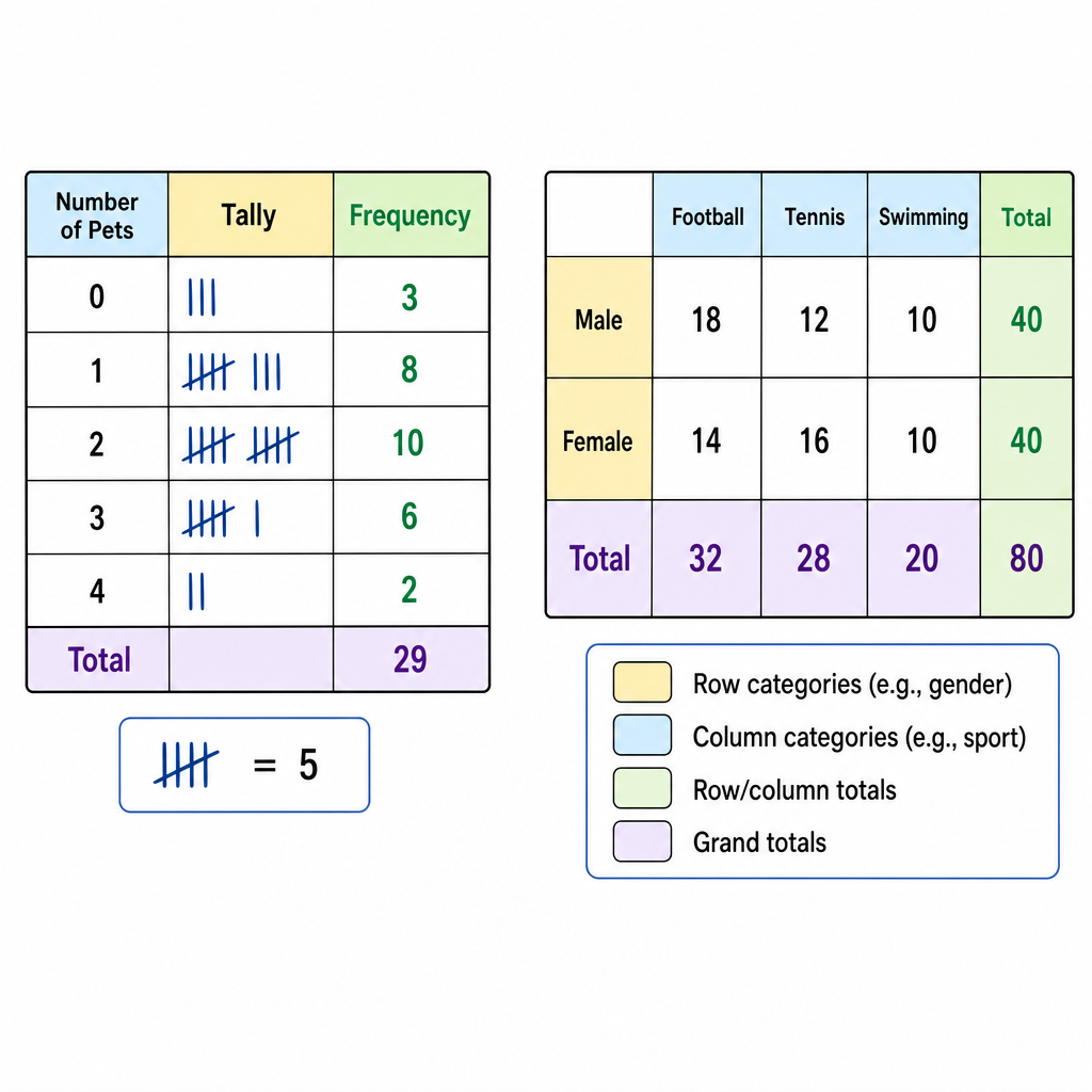
Tally and frequency tables are the simplest move. For small discrete data, list each value, tally it, total it up:
| Shoe size | Tally | Frequency |
| :---: | :---: | :---: |
| 5 | ||| | 3 |
| 6 | |||| | 4 |
| 7 | || | 2 |
Grouped frequency tables are for continuous data or wide ranges. Choose equal class intervals that cover the whole range with no gaps and no overlaps. For continuous data, use : e.g. , . The value goes in the second class, not both. Boundary rules matter. 🎯
Two-way tables handle two variables at once — e.g. gender × sport — with row and column totals. Great for conditional probability questions later.
• Qualitative vs quantitative. Qualitative = non-numerical (colours, favourite artist, sport). Quantitative = numerical.
• Discrete vs continuous. Discrete = specific separate values: number of siblings, shoe size, goals scored. Continuous = any value in a range: height, weight, time. (If you can 'count' it, it's discrete. If you 'measure' it, usually continuous.) ⚖️
Tally and frequency tables are the simplest move. For small discrete data, list each value, tally it, total it up:
| Shoe size | Tally | Frequency |
| :---: | :---: | :---: |
| 5 | ||| | 3 |
| 6 | |||| | 4 |
| 7 | || | 2 |
Grouped frequency tables are for continuous data or wide ranges. Choose equal class intervals that cover the whole range with no gaps and no overlaps. For continuous data, use : e.g. , . The value goes in the second class, not both. Boundary rules matter. 🎯
Two-way tables handle two variables at once — e.g. gender × sport — with row and column totals. Great for conditional probability questions later.
Worked example
Worked Example: Building a Grouped Frequency Table
The heights (cm) of students are: . Build a grouped frequency table using intervals of width starting at . 📏
- 1Spot the range so you know how many classes are needed. Min = , Max = .
- 2Set up classes of width starting at : that's . Six classes will cover everyone.
- 3Tally each value into its class. Watch the boundary rule: goes into , not the class below.
- 4Sanity check — frequencies add up to the total count of values. If not, you lost someone. 🕵️
Answer
8. Interpreting Statistical Data and Comparing Distributions
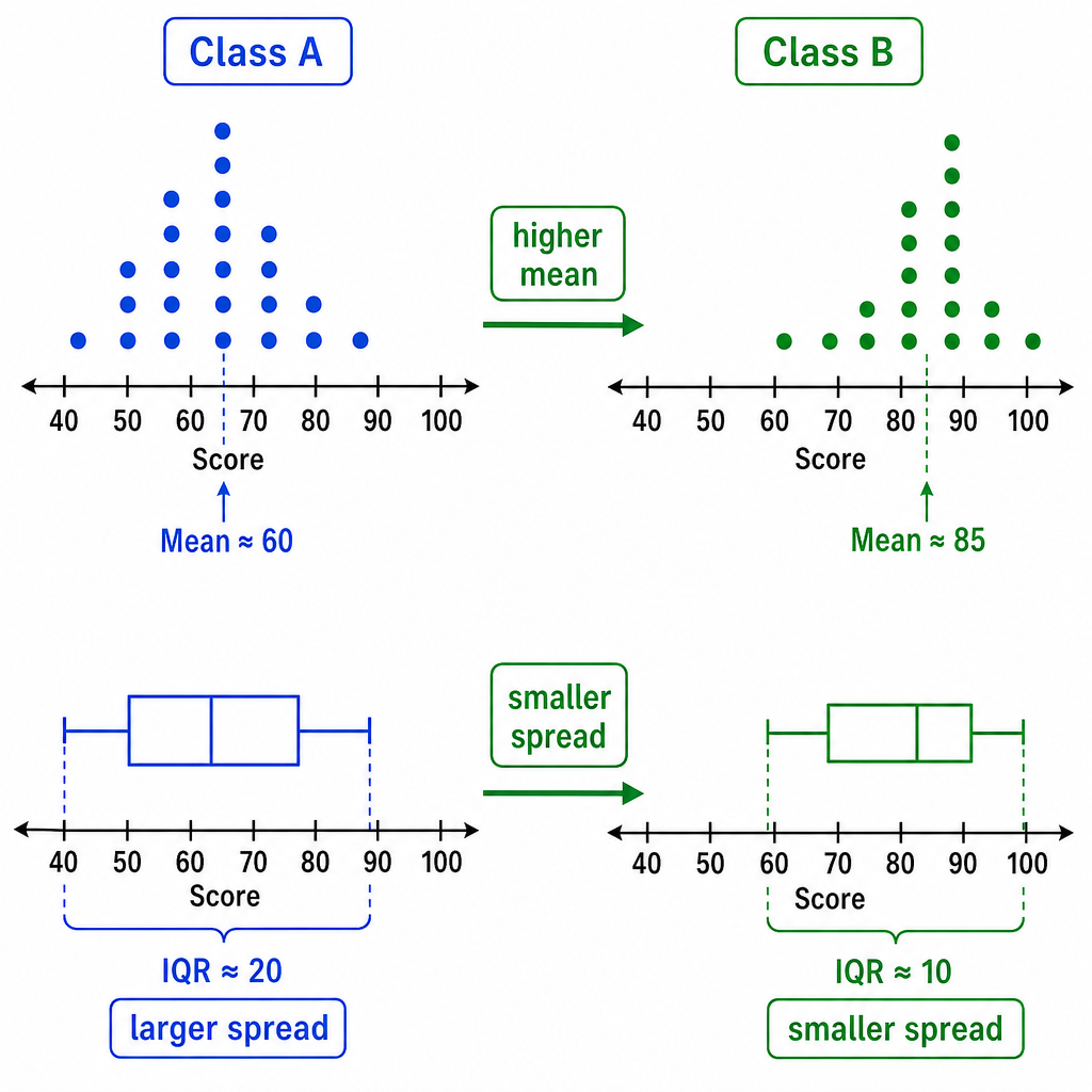
Drawing a graph or table is only half the job — examiners want you to actually read it and compare. The magic formula for comparison questions: use one measure of centre (mean, median, or mode) AND one measure of spread (range, IQR). Every time. 💯
Template sentence shape:
Template sentence shape:
The mean score for Class A is higher than Class B, so on average Class A performed better. The range for Class A is smaller than Class B, so Class A's scores are more consistent.
Two sentences. One about centre, one about spread. That's a full-mark answer.
Caveats that earn bonus credibility:
• Tiny sample sizes are unreliable — call it out if is small.
• Outliers mess with the mean; median is often more robust (the median doesn't care about that one weird data point).
• Correlation ≠ causation. Two things moving together doesn't mean one causes the other. (Ice-cream sales and shark attacks are correlated — both peak in summer. Ice cream doesn't attract sharks. Probably.) 🦈🍦
• A bar chart with an axis not starting at zero can exaggerate differences. Sneaky.
Reading charts: pie chart angles are fractions of the whole — . Stem-and-leaf diagrams must have a key (otherwise you have no idea what the numbers mean). Histograms with unequal widths use frequency density for height, not frequency itself. 🎯
Worked example
Worked Example: Comparing Two Data Sets
The times (in minutes) taken by students from two schools to complete the same puzzle:\\
School A: \\
School B: .\\
Compare the performance of the two schools using the mean and the range. 🧩
School A: \\
School B: .\\
Compare the performance of the two schools using the mean and the range. 🧩
- 1Mean for each = sum ÷ count. Do both.
- 2Range = biggest − smallest. Do both.
- 3Write the comparison using BOTH measures. Centre + spread = full marks. 🎯On average both schools took the same time (mean = 14 min). School A is more consistent: range of 4 min vs 12 min for School B.
Answer
On average both schools took the same time (mean = 14 min). School A is more consistent: range of 4 min vs 12 min for School B.
Worked example
Worked Example: Median, Quartiles and IQR from a Cumulative Frequency Graph
A cumulative frequency graph has been drawn for the test scores of students. Reading from the graph: the cumulative frequency reaches at score , reaches at score , and reaches at score . Estimate (a) the median, (b) the lower quartile, (c) the upper quartile, (d) the interquartile range. 📊
- 1For students, the key positions on the cumulative frequency axis are: median at , lower quartile at , upper quartile at .
- 2Read across from each position to the curve, then down to the score axis. The problem already gave us those lookups.
- 3Interquartile range = . That's the spread of the middle of the data.
Answer
Worked example
Worked Example: Histogram with Unequal Class Widths — Finding Frequency
A histogram has class intervals of unequal widths. One class has a width of and a frequency density of . Find the frequency of that class. (Formula: .) 📈
- 1The formula works both ways — rearrange to make frequency the subject.
- 2Sub in the values.
- 3Sanity check: frequency density is literally 'how many students per unit of class width' — multiplying back by the width unwinds it. Classic example of why histograms with unequal widths use density, not raw frequency, so the area of each bar represents the frequency. Area = frequency = . ✅
Answer
Worked example
Worked Example: Scatter Diagram and Line of Best Fit
A scatter diagram shows hours of revision () and test scores () for students. A line of best fit is ruled through the points. The line passes through and . (a) Describe the correlation. (b) Find the equation of the line of best fit. (c) Use it to estimate the score of a student who revised for hours. 📉➡️📈
- 1As revision hours go up, scores go up — points trend upward on the scatter. That's positive correlation. Fill in the descriptor.Positive correlation
- 2For (b), find the gradient using the two given points on the line.
- 3Sub a known point into and solve for .
- 4For (c), substitute into the line equation.
Answer
Practice this in the app
Unlock the full chapter: practice questions, flashcards, mock papers and notes, free.
Continue revising