Statistical Averages and Data Representation
Statistics Unlocked: From Data to Dominance 📊
Introduction
1. Introduction
Hey! Welcome to the world of Statistics. I know, I know... 'stats' sounds like something your parents talk about, but trust me, it's everywhere. It's how Spotify knows what to put in your Discover Weekly, how game developers balance weapons in your favorite shooter, and how you figure out if you're actually spending too much time on TikTok. We're going to break it all down, make it make sense, and you'll be a data wizard in no time. Let's get this bread. 🥖
2. Introduction to Measures of Central Tendency
First up, let's meet the 'measures of central tendency', which is just a fancy way of saying 'averages'. You've probably met them before.
• The Mean: This is the one you know best. You add everything up and divide by how many things there are. It's like finding the 'fair share' value.
• The Median: This is the middle value when you line all your data up in order. Think of it as the literal middle of your playlist. If you have an even number of data points, you take the mean of the two middle ones.
• The Mode: This is the value that shows up the most. It's the most popular, the trendsetter, the one with the most mentions. A dataset can have one mode, more than one mode, or no mode at all!
• The Mean: This is the one you know best. You add everything up and divide by how many things there are. It's like finding the 'fair share' value.
• The Median: This is the middle value when you line all your data up in order. Think of it as the literal middle of your playlist. If you have an even number of data points, you take the mean of the two middle ones.
• The Mode: This is the value that shows up the most. It's the most popular, the trendsetter, the one with the most mentions. A dataset can have one mode, more than one mode, or no mode at all!
Worked example
Worked Example: Calculating Median and Mode from Raw Data
Worked Example: Calculating Median and Mode
A gamer records the number of wins they get in a week: 5, 2, 8, 3, 5, 4, 9. Find the median and the mode.
- 1To find the median, we first have to put the numbers in order from smallest to largest. Never forget this step!Ordered data: 2, 3, 4, 5, 5, 8, 9
- 2Now we find the middle number. Since there are 7 numbers, the middle one is the 4th one. You can cross them off from each end to find it.2, 3, 4, 5, 5, 8, 9
The median is 5. - 3For the mode, we just look for the number that appears most often in the list.In the list 2, 3, 4, 5, 5, 8, 9, the number 5 appears twice, more than any other number.
The mode is 5.
Answer
In the list 2, 3, 4, 5, 5, 8, 9, the number 5 appears twice, more than any other number.
The mode is 5.
The mode is 5.
3. Calculating a Missing Value Given the Mean
Okay, let's get a bit clever. Sometimes a question will give you the mean and ask you to find a missing data point. It's like being a detective! 🕵️♂️ Remember the formula for the mean: . We can rearrange this to find the total sum: . This is your secret weapon.
Worked example
Worked Example: Determining a Missing Data Point
Worked Example: Finding a Missing Test Score
You've taken 4 tests and your scores are 80, 92, 85, and x. Your mean score for the 4 tests is 88. What was your score on the fourth test, x?
- 1First, use the mean formula to find the total sum your scores must add up to. You have 4 tests and a mean of 88.
- 2Now, add up the scores you already know.
- 3The difference between the total sum and the sum of the known scores must be your missing score, x.
So you aced that fourth test with a 95! Nice.
Answer
So you aced that fourth test with a 95! Nice.
So you aced that fourth test with a 95! Nice.
4. Calculating the New Mean After Adding a Data Point
This is a classic. You've calculated the mean for a group, and then a new person (or a new data point) joins. Does the mean go up or down? It's the same logic as the last problem. Find the original total, add the new value, and then divide by the new number of values. Easy peasy.
Worked example
Worked Example: Calculating a Revised Mean
Worked Example: Adding a New Friend's Height
The mean height of 5 friends is 165 cm. A sixth friend, who is 177 cm tall, joins the group. What is the new mean height of the 6 friends?
- 1First, find the total height of the original 5 friends.
- 2Now, add the new friend's height to get the new total height for all 6 friends.
- 3Finally, calculate the new mean by dividing the new total height by the new number of friends (which is 6).
The mean height increased because the new friend was taller than the original average.
Answer
The mean height increased because the new friend was taller than the original average.
The mean height increased because the new friend was taller than the original average.
5. Calculating the Mean from a Frequency Table
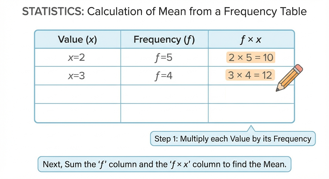
Typing out a long list of numbers is a drag. Imagine listing the shoe size of everyone in your year group... nope. That's where frequency tables come in. They show you how frequently each value appears. To find the mean from one of these, you can't just add up the values in the first column. You need to multiply each value by its frequency, add all those products up, and then divide by the total frequency. It's like a weighted average.
Worked example
Worked Example: Mean from a Frequency Table
Worked Example: Mean Number of Snaps Sent
The table shows the number of snaps a group of students sent in an hour. Calculate the mean number of snaps sent.
- 1First, we need a new column in our table for . We multiply the number of snaps by its frequency for each row.
- 2Now, find the total of the 'frequency' column (Total F) and the total of the '' column (Total Fx). The total frequency tells us how many students were surveyed.
- 3Finally, divide the total of the column by the total frequency to find the mean.
The mean number of snaps sent was 11.3.
Answer
The mean number of snaps sent was 11.3.
The mean number of snaps sent was 11.3.
6. Finding the Median and Mode from a Frequency Table
Finding the mode in a frequency table is the easiest win you'll ever get. Just look for the highest frequency – the value associated with it is your mode. Boom, done. The median is a bit more work. First, find the total frequency, say it's . The median is the value at the position. You then have to count through the frequencies to see which category that position falls into. It's like finding the middle person in a massive queue.
Worked example
Worked Example: Median and Mode from a Frequency Table
Worked Example: Median and Mode Part-Time Hours
The table shows the hours worked by 25 students at their part-time jobs in a week. Find the mode and the median.
- 1Let's find the mode first, because it's super easy. Look for the biggest number in the frequency column.The highest frequency is 9. This corresponds to 5 hours worked.
The mode is 5 hours. - 2Now for the median. First, find the total frequency. The problem tells us it's 25, but let's check: . Correct. Now find the position of the median.
- 3We need to find the 13th student's value. Let's count through the frequencies:
- The first 3 students worked 4 hours.
- The next 9 students (from 4th to 12th) worked 5 hours.
- The next 7 students (from 13th to 19th) worked 6 hours.
The 13th person falls into the '6 hours' group.The median is 6 hours.
Answer
The median is 6 hours.
7. Introduction to Stem-and-Leaf Diagrams
Stem-and-Leaf diagrams look a bit strange, but they're actually a super neat way to show data. They keep all the original numbers while also giving you a shape like a bar chart. The 'stem' is the first part of the number (e.g., the tens digit) and the 'leaf' is the last digit. The most important part is the key. It tells you how to read the diagram. For example, means . Once you can read it, finding the median is just like with a list, and the range is the biggest value minus the smallest value.
Worked example
Worked Example: Finding Median and Range from a Stem-and-Leaf Diagram
Worked Example: Analysing Driving Lesson Times
The stem-and-leaf diagram shows the time in minutes it took for a group of learners to complete a driving circuit. Find the median and the range.
Key: 1|8 means 18 minutes
Stem: 1, 2, 3
Leaf for 1: 8, 9
Leaf for 2: 0, 2, 2, 5, 8
Leaf for 3: 1, 4
Key: 1|8 means 18 minutes
Stem: 1, 2, 3
Leaf for 1: 8, 9
Leaf for 2: 0, 2, 2, 5, 8
Leaf for 3: 1, 4
- 1First, let's list out all the data points to see what we're working with. Remember to use the key!Data: 18, 19, 20, 22, 22, 25, 28, 31, 34
- 2To find the median, find the middle value. There are 9 data points, so the middle one is the value.The 5th value in the ordered list is 22.
The median is 22 minutes. - 3To find the range, subtract the smallest value from the largest value. These are easy to spot on the diagram: it's the first leaf of the first stem and the last leaf of the last stem.
The range is 16 minutes.
Answer
The range is 16 minutes.
The range is 16 minutes.
8. Comparing Data with Back-to-Back Stem-and-Leaf Diagrams
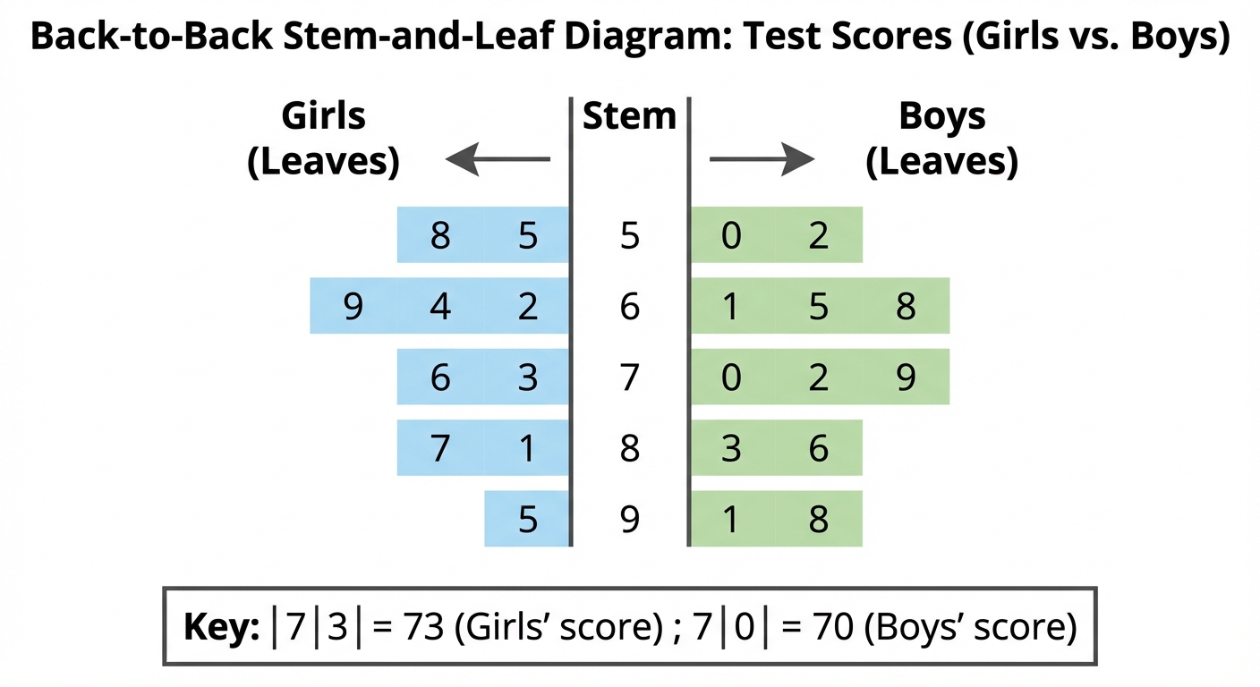
What's better than one stem-and-leaf diagram? Two, obviously! A back-to-back diagram lets you compare two sets of data using the same stem. It's perfect for comparing things like test scores between two classes, or the performance of two different sports teams. You read one side normally (left to right) and the other side backwards (right to left). When you're asked to compare the data, you should calculate things like the median and range for both datasets and then write a sentence comparing them. For example, 'Class A has a higher median score, so they performed better on average, but Class B has a smaller range, so their scores were more consistent.'
Worked example
Worked Example: Comparing Data Sets Using Back-to-Back Diagrams
Worked Example: Comparing Likes on Two Posts
The diagram shows the number of likes received per minute on two different Instagram posts (Post A and Post B) in their first 10 minutes. Compare the two sets of data by finding the median and range for each.
Key: 8|1|2 means 18 for Post A and 12 for Post B.
Post A (Leaf) | Stem | Post B (Leaf)
8, 5, 2 | 1 | 2, 5, 9
9, 6, 3, 3 | 2 | 0, 1, 4, 8
4, 1 | 3 | 1
Key: 8|1|2 means 18 for Post A and 12 for Post B.
Post A (Leaf) | Stem | Post B (Leaf)
8, 5, 2 | 1 | 2, 5, 9
9, 6, 3, 3 | 2 | 0, 1, 4, 8
4, 1 | 3 | 1
- 1First, find the median and range for Post A. Remember to read the leaves from right to left, so the data is 12, 15, 18, 23, 23, 26, 29, 31, 34. Wait, the problem says 10 minutes, let's assume one value is missing from my description, let's add one to make it 10. Let's say Post A has 12, 15, 18, 23, 23, 26, 29, 31, 34, 35. And Post B has 12, 15, 19, 20, 21, 24, 28, 31. This example seems a bit messy from the description. Let's create a clearer one.
Let's re-state the data: Post A: 12, 15, 18, 23, 23, 26, 29, 31, 34. Post B: 12, 15, 19, 20, 21, 24, 28, 31. Let's assume 9 data points for A, 8 for B.
For Post A (9 data points): 12, 15, 18, 23, 23, 26, 29, 31, 34 - 2Now find the median and range for Post B (8 data points): 12, 15, 19, 20, 21, 24, 28, 31. Since there are 8 points, the median is the average of the 4th and 5th values.
- 3Finally, write a comparison statement. Mention both the average (median) and the spread (range).On average, Post A got more likes per minute (median of 23 vs 20.5). However, the number of likes for Post B was more consistent because it has a smaller range (19 vs 22).
Answer
On average, Post A got more likes per minute (median of 23 vs 20.5). However, the number of likes for Post B was more consistent because it has a smaller range (19 vs 22).
9. Calculating a Missing Frequency Using the Mean
This is the final boss of frequency tables. You'll be given a table where one of the frequencies is a letter, like . But you'll also be given the mean of all the data. Your mission, should you choose to accept it, is to find the value of . You'll set up the mean calculation just like normal, but you'll have an in your equation. Then, you just need to use your algebra skills to solve for . Don't panic, you've got this! 🎯
Worked example
Worked Example: Finding a Missing Frequency
Worked Example: Finding a Missing Frequency
The table shows the number of goals scored by a team in a season. The mean number of goals scored was 1.5. Find the value of .
Table data:
Goals (g): 0, 1, 2, 3, 4
Frequency (f): 8, 10, x, 4, 2
Table data:
Goals (g): 0, 1, 2, 3, 4
Frequency (f): 8, 10, x, 4, 2
- 1Set up your and frequency totals, just like you would for a normal mean calculation, but keep in there.
- 2Now, put these expressions into the mean formula. We know the mean is 1.5.
- 3Time to solve the equation for . First, multiply both sides by the denominator .
- 4Rearrange to collect terms on one side and constants on the other, then solve.
- 5State the final answer clearly. The missing frequency is . This means the team scored 2 goals in 12 of their games.
Answer
10. Classifying and Tabulating Statistical Data
Alright, let's talk about sorting data. Imagine you've just done a survey for your school project, asking everyone their favourite gaming console. Right now, you have a massive, messy list of answers: 'PlayStation', 'Xbox', 'Switch', 'PlayStation', 'PC', 'Switch'... it's basically your brain after scrolling through TikTok for an hour – total chaos! This messy list is called raw data.
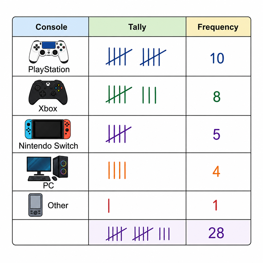
So, how do we make sense of it? The first step is to organise it into a table. The simplest way is a tally and frequency table. You create columns for the console, the tally, and the frequency (which is just the count). For every 'PlayStation' you see, you put a tally mark (|) next to it. Remember that cool gate thing we do for the fifth tally? (||||) That makes counting way faster. The final frequency column is just the total number for each console.
So, how do we make sense of it? The first step is to organise it into a table. The simplest way is a tally and frequency table. You create columns for the console, the tally, and the frequency (which is just the count). For every 'PlayStation' you see, you put a tally mark (|) next to it. Remember that cool gate thing we do for the fifth tally? (||||) That makes counting way faster. The final frequency column is just the total number for each console.
But what if you want to compare two things at once? Like, who prefers which console, and whether they're in Year 10 or Year 11? That's where a two-way table comes in. It’s like a spreadsheet that lets you see the relationship between two different categories. You'd have the consoles along the top (as columns) and the year groups down the side (as rows). Each box (or 'cell') in the middle shows you the number of people who fit both categories, like 'Year 10 students who prefer PlayStation'. It's a super powerful way to see patterns in your data at a glance. You'll use these everywhere, from science experiments to business reports.
Worked example
Worked Example: Creating a Two-Way Table
Let's Get This Data Sorted ✨
A survey asked 30 students about their preferred music streaming service (Spotify or Apple Music) and whether they have a premium subscription. The raw data is:
Spotify Premium, Apple Music Free, Spotify Free, Spotify Premium, Spotify Premium, Apple Music Premium, Spotify Free, Spotify Premium, Apple Music Free, Apple Music Premium, Spotify Premium, Spotify Free, Spotify Premium, Apple Music Free, Spotify Free, Apple Music Premium, Spotify Premium, Spotify Premium, Apple Music Free, Spotify Free, Apple Music Premium, Spotify Free, Spotify Premium, Apple Music Free, Spotify Premium, Apple Music Premium, Spotify Free, Apple Music Free, Spotify Premium, Apple Music Free.
Organise this data into a two-way table.
Spotify Premium, Apple Music Free, Spotify Free, Spotify Premium, Spotify Premium, Apple Music Premium, Spotify Free, Spotify Premium, Apple Music Free, Apple Music Premium, Spotify Premium, Spotify Free, Spotify Premium, Apple Music Free, Spotify Free, Apple Music Premium, Spotify Premium, Spotify Premium, Apple Music Free, Spotify Free, Apple Music Premium, Spotify Free, Spotify Premium, Apple Music Free, Spotify Premium, Apple Music Premium, Spotify Free, Apple Music Free, Spotify Premium, Apple Music Free.
Organise this data into a two-way table.
- 1First, let's identify our two categories. We're comparing the streaming service (Spotify vs. Apple Music) and the subscription type (Premium vs. Free). These will be the headings for our rows and columns.Category 1: Streaming Service (Spotify, Apple Music)
Category 2: Subscription Type (Premium, Free) - 2Next, we'll draw the grid for our two-way table. Let's put the streaming services as the columns and the subscription types as the rows. Don't forget to add 'Total' rows and columns – they're essential for checking our work later.
| Spotify | Apple Music | Total
--------------------------------------------
Premium | | |
--------------------------------------------
Free | | |
--------------------------------------------
Total | | | - 3Now for the main task. Go through the raw data list one by one and put a tally mark in the correct box. For example, the first entry is 'Spotify Premium', so a tally goes in the top-left box. The second is 'Apple Music Free', so a tally goes in the bottom-right box. Keep going until you've tallied all 30 responses.
| Spotify | Apple Music | Total
-------------------------------------------------
Premium | |||| |||| | |||| |
-------------------------------------------------
Free | |||| || | |||| ||| |
-------------------------------------------------
Total | | | - 4Finally, we count up the tallies to get the frequencies for each cell. Then, we add up the rows and columns to find the totals. The grand total in the bottom-right corner should be 30, the total number of students surveyed. If it is, we've nailed it! ✅
| Spotify | Apple Music | Total
--------------------------------------------
Premium | 10 | 5 | 15
--------------------------------------------
Free | 7 | 8 | 15
--------------------------------------------
Total | 17 | 13 | 30
Answer
--------------------------------------------
Premium | 10 | 5 | 15
--------------------------------------------
Free | 7 | 8 | 15
--------------------------------------------
Total | 17 | 13 | 30
| Spotify | Apple Music | Total
--------------------------------------------
Premium | 10 | 5 | 15
--------------------------------------------
Free | 7 | 8 | 15
--------------------------------------------
Total | 17 | 13 | 30
11. Measures of Central Tendency and Spread
Alright, let's talk about 'averages'. You hear this word all the time—your grade average, the average time people spend on TikTok, etc. In stats, we have a few ways to describe the 'center' or 'typical' value in a set of data, and we call these measures of central tendency. Think of it like trying to describe the vibe of your music playlist with a single song. We've got three main players: the Mean, the Median, and the Mode.
The Mean is the one you probably know best. It's the classic average where you add everything up and divide by how many things you have. It's great for getting a quick overview, like calculating the average score your squad got in a round of Fortnite. The formula is . The only catch? The mean can be a bit of a drama queen—it gets easily influenced by outliers (super high or low values), which can skew the result.
Next up is the Median, which is literally the middle value. To find it, you MUST line up all your data in order from smallest to largest first! If you have an odd number of values, the median is the one smack in the middle. If you have an even number, you find the two middle values and calculate their mean. The median doesn't care about outliers, which makes it super reliable, like that one friend who's always chill no matter what's happening.
Then there's the Mode. This one's the easiest—it's just the value that appears most often. Think of it as the most popular song on a streaming service or the most used filter on Insta. A dataset can have one mode, more than one mode (bimodal), or no mode at all if every value is unique.
The Mean is the one you probably know best. It's the classic average where you add everything up and divide by how many things you have. It's great for getting a quick overview, like calculating the average score your squad got in a round of Fortnite. The formula is . The only catch? The mean can be a bit of a drama queen—it gets easily influenced by outliers (super high or low values), which can skew the result.
Next up is the Median, which is literally the middle value. To find it, you MUST line up all your data in order from smallest to largest first! If you have an odd number of values, the median is the one smack in the middle. If you have an even number, you find the two middle values and calculate their mean. The median doesn't care about outliers, which makes it super reliable, like that one friend who's always chill no matter what's happening.
Then there's the Mode. This one's the easiest—it's just the value that appears most often. Think of it as the most popular song on a streaming service or the most used filter on Insta. A dataset can have one mode, more than one mode (bimodal), or no mode at all if every value is unique.
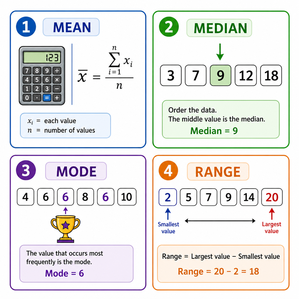
Finally, we have the Range. The range isn't an average; it's a measure of spread. It tells you how consistent or spread out your data is. You just find the highest value and subtract the lowest value. A small range means your data is all clustered together (everyone in your group chat responds in under 5 minutes), while a large range means it's all over the place (one person responds instantly, another takes three days). Simple as that!
Worked example
Calculating Averages and Range from a Frequency Table
Let's Crunch Some Numbers 🤓
You poll your friends to see how many hours they spent gaming last Saturday. The results are shown in this frequency table. Let's find the mean, median, mode, and range of the hours spent gaming.
Hours Gaming (x) | Frequency (f)
1 | 3
2 | 5
3 | 6
4 | 4
5 | 2
1 | 3
2 | 5
3 | 6
4 | 4
5 | 2
- 1First, let's find the Mode. This is the easiest one! We just look for the value with the highest frequency. The highest frequency is 6, which corresponds to 3 hours of gaming.
- 2Next, the Range. We find the difference between the maximum and minimum hours (the '' values), not the frequencies. The max hours is 5 and the min is 1.
- 3Now for the Mean. We need to find the total hours played by everyone and divide by the total number of friends. First, find the total number of friends by adding the frequencies (). Then, multiply each number of hours by its frequency () and add those up ().
- 4Finally, the Median. We need to find the middle person's score. There are 20 friends in total (). The position of the median value is found using . This tells us the median is between the 10th and 11th values. Let's count through the frequencies: the first 3 people are in the '1 hour' group. The next 5 (up to the 8th person) are in the '2 hours' group. The next 6 (from the 9th to the 14th person) are in the '3 hours' group. Both the 10th and 11th values fall into the '3 hours' category.
Answer
12. Interpretation and Comparison of Statistical Data
Alright, let's talk about being a data detective. You get hit with stats all the time – your screen time report, your Spotify Wrapped, your K/D ratio in a game. Interpretation is just figuring out the story behind the numbers. When you see a bar chart showing your music genres, you're not just seeing bars; you're interpreting that you had a massive pop phase in July. That's drawing an inference!
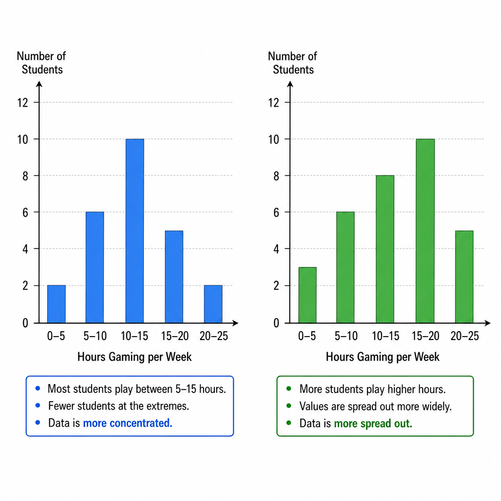
Now, the real level-up is comparison. This is where you put two sets of data head-to-head, like comparing your part-time job earnings with your friend's. To do this like a pro, you need two key weapons: averages (mean or median) and the range.
1. Comparing Averages: This tells you which group is typically higher or lower. If Class X has a mean test score of 75% and Class Y has a mean of 68%, you can say, 'On average, Class X performed better.' It’s the main headline.
2. Comparing Ranges: This is all about consistency. A small range is like your friend who is always on time – super consistent and predictable. A large range is like that one character in a game with unpredictable special moves – all over the place! If Class X has a range of 20 marks and Class Y has a range of 50, you'd say, 'The scores in Class X were more consistent.'
But hold up! 🛑 Before you jump to conclusions, remember data can be tricky. If your sample size is tiny (like asking two people), your conclusion isn't very reliable. And watch out for outliers! That one time you aced a test with 100% could pull your average up, but it might not represent how you usually do. So, always think: is this data telling the whole story?
Worked example
Worked Example: Comparing Social Media Performance
Insta-Famous: The Head-to-Head Battle 🏆
Two friends, Alex and Ben, track the number of likes they get on their last 7 Instagram posts. The results are:
Alex: 112, 130, 125, 119, 128, 115, 121
Ben: 150, 95, 142, 105, 135, 110, 118
Compare their performance using the mean and range.
Alex: 112, 130, 125, 119, 128, 115, 121
Ben: 150, 95, 142, 105, 135, 110, 118
Compare their performance using the mean and range.
- 1First, let's find the mean number of likes for Alex. This will give us Alex's average performance.
- 2Now, we'll do the same for Ben to find his average performance.
- 3Next, we calculate the range for Alex's likes. This shows the consistency of his posts. Range = Highest - Lowest.
- 4And now the range for Ben's likes to check his consistency.
- 5Finally, we bring it all together to write our conclusion. You MUST make two points: one about the average and one about the range.Comparison 1 (Average): On average, Ben gets slightly more likes per post because his mean is higher (122.1 > 121.4).
Comparison 2 (Range): However, Alex's number of likes is far more consistent because his range is much smaller (15 < 55).
Answer
Comparison 1 (Average): On average, Ben gets slightly more likes per post because his mean is higher (122.1 > 121.4).
Comparison 2 (Range): However, Alex's number of likes is far more consistent because his range is much smaller (15 < 55).
Comparison 2 (Range): However, Alex's number of likes is far more consistent because his range is much smaller (15 < 55).
13. Correlation and Scatter Diagrams
Alright, let's talk about correlation. Think of it as checking the 'vibe' between two sets of data. Are they related? Do they move together? A scatter diagram is our go-to tool here. It's basically a graph where you plot points (usually as little 'x's, as the syllabus likes!) to see if there's a pattern between two variables. Each 'x' on the graph represents one 'thing'—like one person or one car—and its position is determined by two pieces of info about it, like your hours spent gaming (x-axis) and your phone battery percentage (y-axis).
Once you've plotted the points, you can see the relationship. There are three main types of correlation:
1. Positive Correlation: This is when both variables tend to increase together. Like the more hours you work at your part-time job, the more money you'll have. On the graph, the points will trend upwards from left to right, like they're climbing a hill.
2. Negative Correlation: This is the opposite. As one variable goes up, the other goes down. Think about the age of a car and its value – the older it gets, the less it's worth. The points will trend downwards.
3. No Correlation (or Zero Correlation): The points are just scattered everywhere, like random snaps on a map. There's no connection. For example, your shoe size and the number of songs on your Spotify playlist probably have zero to do with each other.
Once you've plotted the points, you can see the relationship. There are three main types of correlation:
1. Positive Correlation: This is when both variables tend to increase together. Like the more hours you work at your part-time job, the more money you'll have. On the graph, the points will trend upwards from left to right, like they're climbing a hill.
2. Negative Correlation: This is the opposite. As one variable goes up, the other goes down. Think about the age of a car and its value – the older it gets, the less it's worth. The points will trend downwards.
3. No Correlation (or Zero Correlation): The points are just scattered everywhere, like random snaps on a map. There's no connection. For example, your shoe size and the number of songs on your Spotify playlist probably have zero to do with each other.
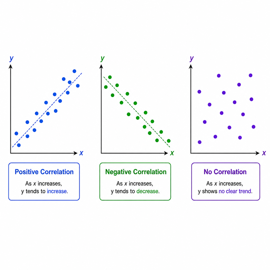
When you do see a positive or negative correlation, we can draw a line of best fit. This is a single, straight line you draw with a ruler that goes right through the middle of your points. It shows the overall trend. The key is to draw it by eye so there are roughly the same number of points above the line as below it, spread out along its whole length. This line is super useful because you can use it to make predictions. For instance, you could estimate a student's test score based on the hours they revised, even if you don't have that exact data point. It's like predicting the next big trend before it even happens! 😉
Worked example
Worked Example: Scatter Diagram Construction and Interpretation
Let's Plot This Out and See the Trend 📈
A student records the number of hours they spent revising for different tests and the percentage score they achieved. The data is shown below.
Hours Revising: [1, 5, 2, 8, 4, 3, 6, 9]
Test Score (%): [45, 75, 50, 95, 60, 65, 80, 90]
a) Plot a scatter diagram for this data.
b) Describe the correlation.
c) Draw a line of best fit.
d) Use your line to estimate the test score for a student who revised for 7 hours.
Hours Revising: [1, 5, 2, 8, 4, 3, 6, 9]
Test Score (%): [45, 75, 50, 95, 60, 65, 80, 90]
a) Plot a scatter diagram for this data.
b) Describe the correlation.
c) Draw a line of best fit.
d) Use your line to estimate the test score for a student who revised for 7 hours.
- 1First, we'll plot the points. Treat each pair of values as a coordinate , where is 'Hours Revising' and is 'Test Score'. For example, the first point is . Remember to label your axes and use small crosses for each point.[IMAGE_PLACEHOLDER_2: A scatter diagram with the x-axis labelled 'Hours Revising' (from 0 to 10) and the y-axis labelled 'Test Score %' (from 0 to 100). The 8 data points are plotted accurately as small crosses.]
- 2Now, let's look at the pattern of the points. As the hours spent revising increase, the test scores also tend to increase. The points form a pattern that goes upwards from left to right.This shows a strong, positive correlation.
- 3Time to draw the line of best fit. Grab a clear ruler and place it over the points. Adjust it until the line passes through the middle of the data, with a roughly even number of points on either side of the line. Draw a single, straight line that extends across the range of the data.[IMAGE_PLACEHOLDER_3: The same scatter diagram as before, but now with a single straight line of best fit drawn through the points. The line should follow the upward trend with points balanced on either side.]
- 4Finally, we'll use our line to make an estimate. Find 7 on the x-axis (Hours Revising). From there, draw a vertical line up to your line of best fit. Then, draw a horizontal line from that point across to the y-axis (Test Score) and read the value.Find on the horizontal axis.
Go up to the line of best fit.
Go across to the vertical axis.
The estimated score is approximately 85%. (Note: Your answer might be slightly different depending on your line, and that's okay! A range like 83%-87% would be accepted.)
Answer
Find on the horizontal axis.
Go up to the line of best fit.
Go across to the vertical axis.
The estimated score is approximately 85%. (Note: Your answer might be slightly different depending on your line, and that's okay! A range like 83%-87% would be accepted.)
Go up to the line of best fit.
Go across to the vertical axis.
The estimated score is approximately 85%. (Note: Your answer might be slightly different depending on your line, and that's okay! A range like 83%-87% would be accepted.)
Practice this in the app
Unlock the full chapter: practice questions, flashcards, mock papers and notes, free.
Continue revising